str(plot)#> function (x, y, ...)An important reason, why statisticians and data analysts use R, is the excellent ability to produce a wide range of graphics to quickly and easily visualize data. There are multiple reasons, why R users want to use graphical representations (graphs or plots) in data analysis:
The first four are summarizing, what is usually called “Exploratory Data Analysis”.
To make graphs R provides several plotting systems:
Base R [1], provided by the base packages:
Lattice [2], provided by the packages:
Ggplot2 [3] or its successor Ggvis [4], provided, respectively, by the packages:
In this lesson the Base R plotting system will be introduced, which is the oldest graphics system in R. The Base R plotting system is based on the, so-called, “Artist’s palette” model. In this model you start with a blank canvas, usually with a plot() function (or similar) and build up from there by adding annotation functions, to add to or modify (text, lines, points, axis) an existing graph/plot.
The Base R plotting system conveniently mirrors, how data analysts think of building plots and analyzing data. It has, however, one major drawback, that you can not go back once a plot has been started, e.g. to adjust margins. You need to plan in advance, or keep track of how you build up your plot in a script, which you can modify and rerun whenever you want.
Graphs/plots created with the base R graphics system are difficult to “translate” to others once a new plot has been created (there is no grammar of graphics, i.e. no graphical “language”). Creation of graphs or plots is just a series of R commands, but this also means that it provides an easy and fast system.
As mentioned above, the first phase in creating a base plot is initializing a new plot. This is done with, what is called in the “Introduction to R” manual [5], a high-level command. High-level plotting functions are designed to create a complete plot of the data passed as arguments to the function. When appropriate, axis, labels, and titles are automatically generated, unless you request otherwise. Keep in mind that high-level plotting commands always start a new plot, erasing the current plot if necessary.
The plot() function is one of the most used high-level plotting functions in R. It is a generic function. Meaning that the type of plot created depends on the type or class of the first argument.
str(plot)#> function (x, y, ...)If x and y, are both vectors, plot() creates a scatterplot of y versus x (the same is achieved by plot(y ~ x). When x is passed as a factor and y is passed as a numeric vector, the plot() function creates boxplots of y for each level of x.
#> [1] "numeric"class(iris$Petal.Width)#> [1] "numeric"#> [1] "factor"plot(x = iris$Species, y = iris$Sepal.Length)
The scatter- and boxplot, of the code displayed above, are shown in Figure 9.1
In case only the x argument is passed as a time series, this produces a time-series plot. When the x argument is a factor, a barplot of the factor is created.
#> [1] "ts"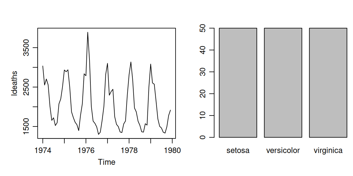
Examples of both the time series plot and the barplot, as given in the code printed above, are shown in Figure 9.2.
The graphics package contains a load of other high-level functions to produce different types of plots. Some of these functions, really worth mentioning, are (check out their individual help pages with ?functionname for specification of function arguments and examples):
qqnorm(x)
qqline(x)
qqplot(x, y)
Distribution-comparison plots. The first, qqnorm(x), plots the numeric vector x against the expected Normal order scores (a normal scores plot) and the second, qqline(x), adds a straight line to such a plot by drawing a line through the distribution and data quartiles. Officially the qqline() function is a low-level plotting command, because it adds to the existing qqnorm() plot. However, in this case the one can not exist without the other in generating a Q-Q plot, and, therefore, its is usually counted as a high-level plotting command. The third form, qqplot(x, y), plots the quantiles of x against those of y to compare their respective distributions.
hist(x)
hist(x, nclass = n)
hist(x, breaks = b, ...)
Produces a histogram of the numeric vector x. A sensible number of classes is usually chosen, but a recommendation can be given with the nclass argument. Alternatively, the breakpoints can be specified exactly with the breaks argument. If the probability = TRUE argument is given, the bars represent relative frequencies divided by bin width instead of counts.
boxplot(x, ...)Produce box-and-whisker plot(s) of the given (grouped) values. The generic function boxplot() currently has a default method:
boxplot(iris$Sepal.Length)and a formula interface:
boxplot(iris$Sepal.Length ~ iris$Species)If multiple groups are supplied either as multiple arguments or via a formula, parallel boxplots will be plotted, in the order of the arguments or the order of the levels of the factor (see ?factor). Missing values are ignored when forming boxplots.
barplot(height, ...)Creates a bar plot with vertical or horizontal bars. For example, as shown in Figure 9.3:
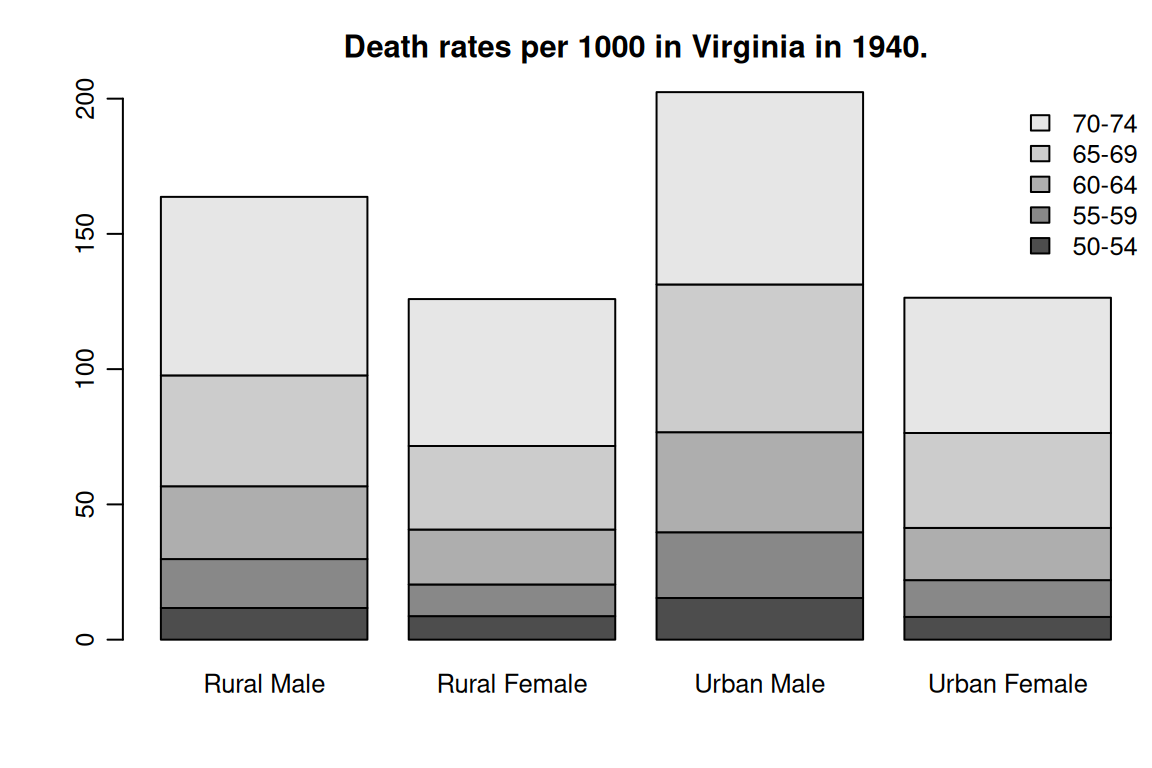
image(x, y, z, ...)
contour(x, y, z, ...)
persp(x, y, z, ...)
Plots of three variables. The image() plot draws a grid of rectangles using different colors to represent the value of z, the contour() plot draws contour lines to represent the value of z, and the persp() plot draws a 3D surface.
matplot(x, y, ...)Plot the columns of one matrix against the columns of another. Example of what you can do with the matplot() function is shown in Figure 9.4. The code for this example you can find in the examples section on the help page of the matplot() function.

pairs(x, ...)As you have seen in the exercise about multiple regression (Section 7.2.1), the pairs() function produces a matrix of scatterplots. It is one of two very useful functions in R for representing multivariate data.
There are a number of arguments which may be passed to high-level graphics functions in order to generate a complete plot in one function call. These arguments are defined as:
add = TRUEForces the function to act as a low-level graphics function, superimposing the plot on the current plot (some functions only).
axes = FALSESuppresses generation of axes; useful for adding your own custom axes with the axis() function. The default, axes = TRUE, means include axes.
log = "x"
log = "y"
log = "xy"
Causes the \(x\), \(y\) or both axes to be logarithmic. This will work for many, but not all, types of plot.
The type argument controls the type of plot produced (see Figure 9.5 for examples), as follows:
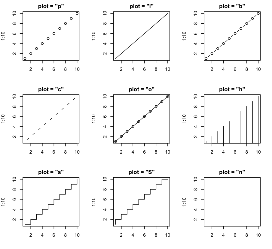
type argument.
type = "p"Plot individual points (the default)
type = "l"Plot lines
type = "b"Plot points connected by lines (both).
type = "o"Plot points overlaid by lines.
type = "h"Plot vertical lines from points to the zero axis (high-density).
type = "s"
type = "S"
Step-function plots. In the first form, type = "s", the top of the vertical defines the point; in the second, type = "S", the bottom.
type = "n"No plotting at all. However, axes are still drawn (by default) and the coordinate system is set up according to the data. Ideal for creating plots with subsequent low-level graphics functions.
xlab = "text string"
ylab = "text string"
Axis labels for the \(x\) and \(y\) axes. Use these arguments to change the default labels, usually the names of the objects used in the call to the high-level plotting function.
xlim = c(xmin, xmax)
ylim = c(ymin, ymax)
Coordinate ranges for the \(x\) and \(y\) axes in a plot. This will work for many, but not all, high-level plotting functions. By default, the range of the data supplied to the high-level plotting function is used, unless explicitly set with the xlim and ylim arguments.
main = "text string"Figure title, placed at the top of the plot in a large font.
sub = "text string"Sub-title, placed just below the \(x\)-axis in a smaller font.
Sometimes the high-level plotting functions don’t produce exactly the kind of desired plot. In this case, low-level plotting commands can be used to add extra information (such as points, lines or text) to the current plot (created with a high-level plotting function).
Some of the more useful low-level plotting functions are:
points(x, y)
lines(x, y)
Adds points or connected lines to the current plot. plot()’s type argument can also be passed to these functions (and defaults to "p" for points() and "l" for lines()).
text(x, y, labels, ...)Add text to a plot at points given by x, y. Normally labels is an integer or character vector in which case labels[i] is plotted at point (x[i], y[i]). The default is 1:length(x).
The text() function is often used in the sequence plot(x, y, type = "n"); text(x, y, names).
The plot() function argument type = "n" suppresses the points but sets up the axes, and the text() function supplies special characters, as specified by the character vector names for the points.
abline(a, b)
abline(h = y)
abline(v = x)
abline(lmObj)
Adds a line of slope b and intercept a to the current plot. h = y may be used to specify \(y\)-coordinates for the heights of horizontal lines to go across a plot, and v = x similarly for the \(x\)-coordinates for vertical lines. Also, lmObj may be list with a coefficients component of length 2 (such as the result of model-fitting functions), which are taken as an intercept and slope, in that particular order.
polygon(x, y, ...)Draws a polygon defined by the ordered vertices in (x, y) and (optionally) shade it in with hatch lines, or fill it if the graphics device allows the filling of figures.
legend(x, y, legend, ...)Adds a legend to the current plot at the specified position. Plotting characters, line styles, colors etc., are identified with the labels in the character vector legend. At least one other argument v (a vector the same length as legend) with the corresponding values of the plotting unit must also be given, as follows:
legend( , fill = v)Colors for filled boxes
legend( , col = v)Colors in which points or lines will be drawn
legend( , lty = v)Line styles
legend( , lwd = v)Line widths
legend( , pch = v)Plotting characters (character vector)
title(main, sub)Adds a title main to the top of the current plot in a large font and (optionally) a sub-title sub at the bottom in a smaller font.
axis(side, ...)Adds an axis to the current plot on the side given by the first argument (1 to 4, counting clockwise from the bottom.) Other arguments control the positioning of the axis within or beside the plot, and tick positions and labels. Useful for adding custom axes after calling plot() with the axes = FALSE argument.
Low-level plotting functions usually require some positioning information (e.g., \(x\) and \(y\) coordinates) to determine where to place the new plot elements. Coordinates are given in terms of user coordinates which are defined by the previous high-level graphics command and are chosen based on the supplied data.
Where x and y arguments are required, it is also sufficient to supply a single argument being a list with elements named x and y. Similarly, a matrix with two columns is also valid input.
In some cases, it is useful to add mathematical symbols and formulae to a plot. This can be achieved in R by specifying an expression rather than a character string in any one of the text(), mtext(), axis(), or title() functions. For example, the following code draws the formula for the Binomial probability function:
text(x, y, expression(paste(bgroup("(", atop(n, x), ")"), p^x, q^{n-x})))More information, including a full listing of the features available can obtained from within R using the commands:
help(plotmath)
example(plotmath)
demo(plotmath)When creating graphics, particularly for presentation or publication purposes, R’s defaults do not always produce exactly that which is required. You can, however, customize almost every aspect of the display using graphics parameters. R maintains a list of a large number of graphics parameters which control things such as line style, colors, figure arrangement and text justification among many others. Every graphics parameter has a name (such as ‘col’, which controls colors,) and a value (a color number, for example.)
A separate list of graphics parameters is maintained for each active device, and each device has a default set of parameters when initialized. Graphics parameters can be set in two ways: either permanently, affecting all graphics functions which access the current device; or temporarily, affecting only a single graphics function call.
The par() function is used to access and modify the list of graphics parameters for the current graphics device.
par()Without arguments, returns a list of all graphics parameters and their values for the current device. `par(c("col", "lty")) With a character vector argument, returns only the named graphics parameters (again, as a list).
par(col = 4, lty = 2)With named arguments (or a single list argument), sets the values of the named graphics parameters, and returns the original values of the parameters as a list.
Setting graphics parameters with the par() function changes the value of the parameters permanently, in the sense that all future calls to graphics functions (on the current device) will be affected by the new value. You can think of setting graphics parameters in this way as setting “default” values for the parameters, which will be used by all graphics functions unless an alternative value is given.
Calls to par() always affect the global values of graphics parameters, even when par() is called from within a function.
Changing graphics parameters globally is often undesirable behavior. Usually we want to set some graphics parameters, do some plotting, and then restore the original values so as not to affect the user’s R session. You can restore the initial values by saving the result of par() when making changes, and restoring the initial values when plotting is complete.
oldpar <- par(col = 4, lty = 2)
<some plotting commands>
par(oldpar)
To save and restore all settable graphical parameters use:
oldpar <- par(no.readonly = TRUE)
  <plotting commands>
par(oldpar)Graphics parameters may also be passed to (almost) any graphics function as named arguments. This has the same effect as passing the arguments to the par() function, except that the changes only last for the duration of the function call. For example: plot(x, y, pch = "+"), produces a scatterplot using a plus sign as the plotting character, without changing the default plotting character for future plots.
Unfortunately, this is not implemented entirely consistently and it is sometimes necessary to set and reset graphics parameters using the par() function.
The following sections detail many of the commonly-used graphical parameters. The R help documentation for the par() function provides a more concise summary; this is provided as a somewhat more detailed alternative.
Graphics parameters will be presented in the following form:
name = valueA description of the parameter’s effect. name is the name of the parameter, that is, the argument name to use in calls to par() or a graphics function. value is a typical value you might use when setting the parameter.
Note that axes is not a graphics parameter but an argument to a few plot methods: see xaxt and yaxt.
R plots are made up of points, lines, text and polygons (filled regions). Graphical parameters exist which control how these graphical elements are drawn, as follows:
pch = "+"Character to be used for plotting points. The default varies with graphics drivers, but it is usually a “”. Plotted points tend to appear slightly above or below the appropriate position unless you use “.” as the plotting character, which produces centered points.
pch = 4When pch is given as an integer between 0 and 25 inclusive, a specialized plotting symbol is produced. The symbols are shown in Figure 9.6.
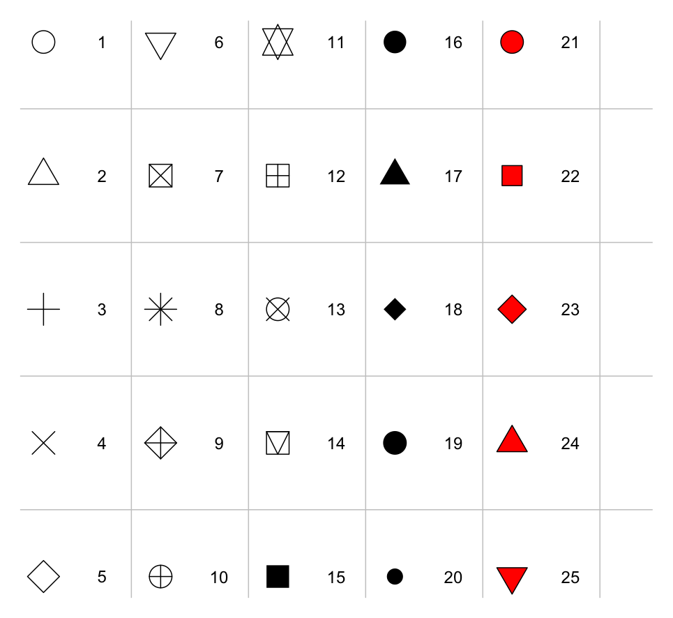
pch symbols.
Those from 21 to 25 may appear to duplicate earlier symbols, but can be colored in different ways: see the help on the points() function and its examples.
In addition, pch can be a character or a number in the range 32:255 representing a character in the current font.
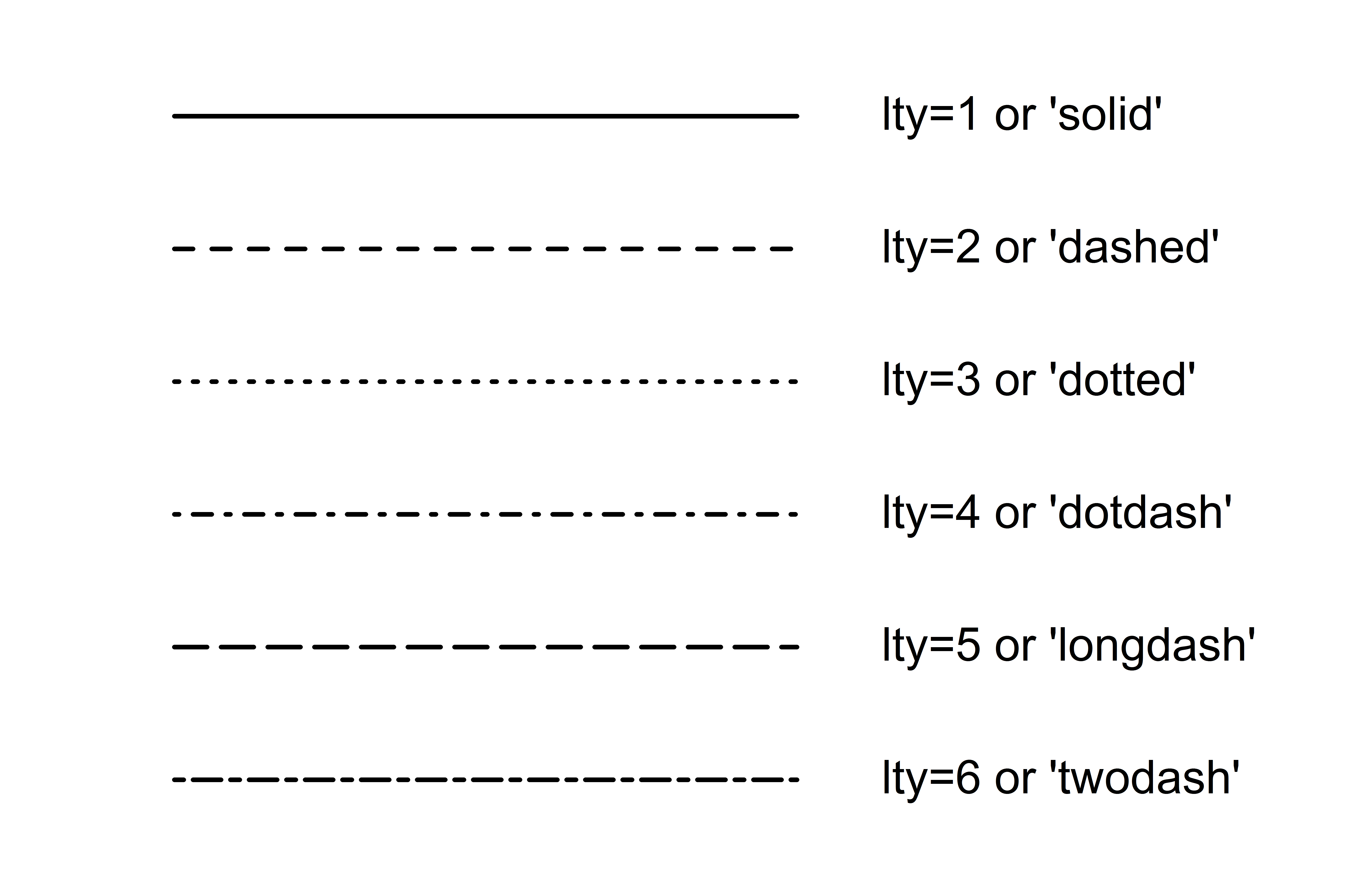
lty = 2Line types. Alternative line styles are not supported on all graphics devices (and vary on those that do) but line type 1 is always a solid line, line type 0 is always invisible, and line types 2 and onwards are dotted or dashed lines, or some combination of both. Figure 9.7 shows some possible values for lty.
lty.
lwd = 2Line widths. Desired width of lines, in multiples of the “standard” line width. Affects axis lines as well as lines drawn with lines(), etc. Not all devices support this, and some have restrictions on the widths that can be used.
col = 2Colors to be used for points, lines, text, filled regions and images. A number from the current palette (see ?palette for help) or a named color. To see a list of possible color names execute colors() in the console or search in Google on “named colors r”.
col.axis
col.lab
col.main
col.sub
The color to be used for axis annotation, \(x\) and \(y\) labels, main and sub-titles, respectively.
font = 2An integer which specifies which font to use for text. If possible, device drivers arrange so that 1 corresponds to plain text, 2 to bold face, 3 to italic, 4 to bold italic and 5 to a symbol font (which include Greek letters).
font.axis
font.lab
font.main
font.sub
The font to be used for axis annotation, \(x\) and \(y\) labels, main and sub-titles, respectively.
adj = -0.1Justification of text relative to the plotting position. 0 means left justify, 1 means right justify and 0.5 means to center horizontally about the plotting position. The actual value is the proportion of text that appears to the left of the plotting position, so a value of -0.1 leaves a gap of 10% of the text width between the text and the plotting position.
cex = 1.5Character expansion. The value is the desired size of text characters (including plotting characters) relative to the default text size.
cex.axis
cex.lab
cex.main
cex.sub
The character expansion to be used for axis annotation, \(x\) and \(y\) labels, main and sub-titles, respectively.
Many of R’s high-level plots have axes, and you can construct axes yourself with the low-level axis() graphics function. Axes have three main components: the axis line (line style controlled by the lty graphics function argument), the tick marks (which mark off unit divisions along the axis line) and the tick labels (which mark the units.) These components can be customized with the following graphics parameters.
lab = c(5, 7, 12)The first two numbers are the desired number of tick intervals on the \(x\) and \(y\) axes respectively. The third number is the desired length of axis labels, in characters (including the decimal point.) Choosing a too-small value for this parameter may result in all tick labels being rounded to the same number!
las = 1Orientation of axis labels. 0 means always parallel to axis, 1 means always horizontal, and 2 means always perpendicular to the axis.
mgp = c(3, 1, 0)Positions of axis components. The first component is the distance from the axis label to the axis position, in text lines. The second component is the distance to the tick labels, and the final component is the distance from the axis position to the axis line (usually zero). Positive numbers measure outside the plot region, negative numbers inside.
tck = 0.01Length of tick marks, as a fraction of the size of the plotting region. When tck is small (less than 0.5) the tick marks on the \(x\) and \(y\) axes are forced to be the same size. A value of 1 gives grid lines. Negative values give tick marks outside the plotting region. Use tck = 0.01 and mgp = c(1, -1.5, 0) for internal tick marks.
xaxs = "r"
yaxs = "i"
Axis styles for the \(x\) and \(y\) axes, respectively. With styles "i" (internal) and "r" (the default) tick marks always fall within the range of the data, however style "r" leaves a small amount of space at the edges. (The S language has other styles not implemented in the R language.)
A single plot in R is known as a figure and comprises a plot region surrounded by margins (possibly containing axis labels, titles, etc.) and (usually) bounded by the axes themselves. A typical figure is shown in Figure 9.8.

Graphics parameters controlling figure layout include:
mai = c(1, 0.5, 0.5, 0)Widths of the bottom, left, top and right margins, respectively, measured in inches.
mar = c(4, 2, 2, 1)Similar to mai, except the measurement unit is text lines.
The function arguments mar and mai are equivalent in the sense that setting one changes the value of the other. The default values chosen for this parameter are often too large; the right-hand margin is rarely needed, and neither is the top margin if no title is being used. The bottom and left margins must be large enough to accommodate the axis and tick labels. Furthermore, the default is chosen without regard to the size of the device surface: for example, using the postscript() driver with the height = 4 argument will result in a plot which is about 50% margin unless mar or mai are set explicitly. When multiple figures are in use (see below) the margins are reduced, however this may not be enough when many figures share the same page.
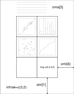
R allows you to create an \(n\) by \(m\) array of figures on a single page. Each figure has its own margins, and the array of figures is optionally surrounded by an outer margin, as shown in Figure 9.9.
The graphical parameters relating to multiple figures are as follows:
mfcol = c(3, 2)
mfrow = c(2, 4)
Set the size of a multiple figure array. The first value is the number of rows; the second is the number of columns. The only difference between these two parameters is that setting mfcol causes figures to be filled by column; mfrow fills by rows.
The layout in the Figure could have been created by setting mfrow = c(3, 2); the figure shows the page after four plots have been drawn.
Setting either of these can reduce the base size of symbols and text (controlled by par("cex") and the point size of the device). In a layout with exactly two rows and columns the base size is reduced by a factor of 0.83: if there are three or more of either rows or columns, the reduction factor is 0.66.
mfg = c(2, 2, 3, 2)Position of the current figure in a multiple figure environment. The first two numbers are the row and column of the current figure; the last two are the number of rows and columns in the multiple figure array. Set this parameter to jump between figures in the array. You can even use different values for the last two numbers than the true values for unequally-sized figures on the same page.
fig = c(4, 9, 1, 4) / 10Position of the current figure on the page. Values are the positions of the left, right, bottom and top edges respectively, as a percentage of the page measured from the bottom left corner. The example value would be for a figure in the bottom right of the page. Set this parameter for arbitrary positioning of figures within a page. If you want to add a figure to a current page, use new = TRUE as well (unlike S).
oma = c(2, 0, 3, 0)
omi = c(0, 0, 0.8, 0)
Size of outer margins. Like mar and mai, the first measures in text lines and the second in inches, starting with the bottom margin and working clockwise.
Outer margins are particularly useful for page-wise titles, etc. Text can be added to the outer margins with the mtext() function with argument outer = TRUE. There are no outer margins by default, however, so you must create them explicitly using oma or omi.
More complicated arrangements of multiple figures can be produced by the split.screen() and layout() functions, as well as by the grid and lattice packages.
R can generate graphics (of varying levels of quality) on almost any type of display or printing device. Before this can begin, however, R needs to be informed what type of device it is dealing with. This is done by starting a device driver. The purpose of a device driver is to convert graphical instructions from R (“draw a line,” for example) into a form that the particular device can understand.
Device drivers are started by calling a device driver function. There is one such function for every device driver: type help(Devices) or ?Devices for a list of them all. For example, issuing the command: postscript(), causes all future graphics output to be sent to the printer in PostScript format. Some commonly-used device drivers are:
X11()For use with the X11 window system on Unix-alikes.
windows()For use on Windows.
quartz()For use on macOS.
postscript()For printing on PostScript printers, or creating PostScript graphics files.
pdf()Produces a PDF file, which can also be included into PDF files.
png()Produces a bitmap PNG file (not always available: see its help page).
jpeg()Produces a bitmap JPEG file, best used for image plots (not always available: see its help page).
When you have finished with a device, be sure to terminate the device driver by issuing the command:
dev.off()This ensures that the device finishes cleanly; for example in the case of hard copy devices this ensures that every page is completed and has been sent to the printer. (This will happen automatically at the normal end of a session.)
In RStudio graphs are created directly on the Plots tab of Panel 4 (see Figure 1.5). RStudio opens a device for you. Once your graph is complete, you can select Export in the menu of the Plot tab and choose in which format you want to save it. If you want to create a graph in a script or function and save, you need to specify the device and close it in your script or function.
Start swirl() from the package swirl, as you have done before, and work through lesson 15. In this lesson, you’ll learn about the Base Graphics System in R.
In O&L Section 4.14 (in both the \(6^{\mbox{th}}\) and \(7^{\mbox{th}}\) Edition) you can read in detail how you can evaluate whether or not a population distribution is normal. You do this by constructing a Q-Q plot and performing a test of Normality (e.g. Shapiro-Wilk test or Kolmogorov-Smirnov test). There is also a knowledge clip available about the construction of Q-Q plots on YouTube (see https://youtu.be/vBZaRSj1Aic).
The steps involved in building a Q-Q plot are:
Ranking the observed values, with averaging for ties
Assigning proportions to the ranked observed values with a proportion estimation formula (e.g. Blom’s)
Calculating the theoretical standard normal quantiles for proportion values of the ranked observed values
Transforming the calculated theoretical standard normal quantiles with the mean and standard deviation from the original data into expected normal values
Plotting the expected normal values against the observed values and adding the \(y = x\) line
In this exercise you will use the data about the Fish quality and Delay problem, presented in Lesson 4, to build your own Q-Q plot by using only the residuals and performing a test of Normality on the residuals.
When using SPSS you would use from the top menu Analyze \(\rightarrow\) Descriptive Statistics \(\rightarrow\) Explore\(\ldots\) to build a Q-Q plot and perform a test of Normality on the Unstandardized Residual [RES_1]. Figure 9.10 shows the Q-Q plot generated with SPSS.
You see that it differs from the Q-Q plot created in Lesson 4 with the functions qqnorm() and qqline().
Write a script, that recreates in R the Normal Q-Q plot of the Unstandardized Residual as generated with SPSS (without the light grey color of the plot region). Use the following:
The data about quality and delay as contained in the fish_quality_vs_delay.csv file
The rank() function for ranking the residuals. Check the help page for function arguments!
Blom’s proportion estimation formula, \(p = \frac{i - 0.375}{n + 0.25}\) with \(i =\) observation rank and \(n =\) total number of observations, to calculate the proportions of the ranked residuals.
The qnorm() function to calculate the theoretical standard normal quantiles (z-values) for proportion values of the ranked residuals. Read the help page of qnorm() for specification of function arguments!
The abline() function to add the \(y = x\) line. Check the function arguments on the appropriate help page.
Once you have recreated the Q-Q plot in R, use the shapiro.test() function to perform a test of Normality. Remember that the Shapiro-Wilk test works best for data sets with less than 50 observations, whereas the Kolmogorov-Smirnov test is generally applied for data sets with more than 50 observations. What is your conclusion with respect to the assumptions for a simple linear regression model of fish quality against delay?
For theory see O&L Sections 5.9, 6.3, 6.5, 8.6, 10.3 (in the \(7^{\mbox{th}}\) Edition skip McNemar Test), 10.4, 10.5 (\(6^{\mbox{th}}\) and \(7^{\mbox{th}}\) Ed. [6,7]).
When making inferences about the difference between two population proportions (\(\pi_1 - \pi_2\)) in R the function fisher.test() can be used, when you need to do a Fisher Exact Test. The function calculates a p-value based on the Hypergeometric distribution. To calculate this p-value you can also use the dhyper() and phyper() functions. Remember that the Hypergeometric distribution is a discrete distribution function, so correct your outcome when necessary. For example, using Example 10.9 (\(6^{\mbox{th}}\) Ed. Example 10.8) from O&L:
A clinical trial is conducted to compare two drug therapies for leukemia: P and PV. Twenty-one patients were assigned to drug P and forty-two patients to PV. Table 9.1 summarizes the successes and failures of the two drug therapies.
| Drug | Success | Failure | Total |
|---|---|---|---|
| PV | 38 | 4 | 42 |
| P | 14 | 7 | 21 |
| Total | 52 | 11 | 63 |
Is there significant evidence that the proportion of patients obtaining a successful outcome is higher for drug PV than for drug P?
Checking the conditions: \[ n_1\pi_1 = 38 \geq 5,\ n_1(1 - \pi_1) = 4 < 5,\ n_2\pi_2 = 14 \geq 5\ \mbox{and}\ n_2(1 - \pi_2) = 7 \geq 5 \]
Because one of the four conditions is violated, the large sample test should not be applied. The Fisher Exact Test will be applied to this data to test the following hypotheses \(\mbox{H}_0:\ \pi_P \geq \pi_{PV}\) vs. \(\mbox{H}_{\mbox{a}}:\ \pi_P < \pi_{PV}\).
To calculate the p-value the hypergeometric distribution can be used in R. When \(x\) represents the number of successes for drug PV, then the expected value for the hypergeometric distribution can be calculated as \(\mu = \frac{52*42}{63} = 34.667\). The p-value for the problem is then given by \(P(x \geq 38) = 1 - P(x \leq 37)\). In R \(P(x = 38) \approx 0.0211\) can be calculated with dhyper(x = 38, m = 42, n = 21, k = 52), which is equal to dhyper(x = 38, m = 52, n = 11, k = 42). \(P(x \leq 37) \approx 0.9746\) can be calculated with phyper(q = 37, m = 42, n = 21, k = 52), which is equal to phyper(q = 37, m = 52, n = 11, k = 42) (R by default uses the argument lower.tail = TRUE). Therefore, the p-value = \(P(x \geq 38) \approx 0.0254\).
Conclusion: For all values of \(\alpha \leq .025\) the p-value \(\approx 0.0254 > \alpha\), there is not significant evidence that the proportion of patients obtaining a successful outcome is higher for drug PV than for drug P.
Recent studies of the private practices of physicians, who saw no Medicaid patients, suggested that the median length of each patient visit was 22 minutes. It is believed, that the median visit length in practices with a large Medicaid load is shorter than 22 minutes. A random sample of 20 visits in practices with a large Medicaid load yielded, in order, the following visit lengths in minutes: 9.4, 13.4, 15.6, 16.2, 16.4, 16.8, 18.1, 18.7, 18.9, 19.1, 19.3, 20.1, 20.4, 21.6, 21.9, 23.4, 23.5, 24.8, 24.9, 26.8.
Based on these data, is there sufficient evidence (\(\alpha = .025\)) to conclude that the median visit length in practices with a large Medicaid load is shorter than 22 minutes? To answer this question perform a Sign Test (using the SIGN.test() function from the BSDA package) and mention all steps you require to reach your conclusion.
Albatrosses flying between continents: which journey is shorter, the outward journey or the homeward journey? Of eight albatrosses the number of days of their journey are measured. See data in Table 9.2 (the data is also available in albatros_data.csv):
| bird | outward | homeward |
|---|---|---|
| 1 | 19 | NA |
| 2 | 28 | 31 |
| 3 | 23 | 25 |
| 4 | 20 | 31 |
| 5 | 20 | 33 |
| 6 | 24 | 34 |
| 7 | 24 | 21 |
| 8 | 22 | 32 |
Test for systematic difference in flying times using a sign test with \(\alpha = 0.05\).
Calculate the test statistic for the sign test and p-value, with pbinom(), given by SIGN.test() using regular commands in the console.
Test for systematic difference in flying times using the Wilcoxon Signed Rank Test with \(\alpha=0.05\). For the Wilcoxon Signed Rank Test in R you can use the function wilcox.test() (read the help page on how to specify the function arguments). Mention all steps needed to reach your conclusion.
Calculate the test statistics for the Wilcoxon Signed Rank Test in R using regular commands in the console, and calculate the exact p-value using the psignrank() function. The psignrank() function provides the Wilcoxon Signed Rank distribution function in R and gives the probability for a given quantile and sample size.
We compare the yields (in pounds) of five different varieties (A, B, C, D and E) of 4-year-old orange trees in an orchard. From each variety 7 trees are randomly sampled from this orchard.
The data for this exercise is the same as used in Section 6.2.1, were you used it in an exercise about One-Way ANOVA. The name of the data file is orange_tree_yield.csv.
Use the Kruskal-Wallis test (kruskal.test()) to test the null hypothesis \(\mbox{H}_0\) that the five varieties have the same yield distributions. Use \(\alpha=0.01\). Give the null hypothesis \(\mbox{H}_0\), the test statistic, outcome and p-value. Finally, give the conclusion in words.
A laboratory is comparing a test drug to a standard drug against high blood pressure. In many clinical trials at many different locations, the standard drug was administered to patients with comparable hypertension. For this large patient group the fractions of patients in the four categories (1) marked decrease, (2) moderate decrease, (3) slight decrease, and (4) stationary are (0.5, 0.25, 0.1, 0.15). In a clinical trial with a random sample of 200 patients with high blood pressure, the numbers of patients in the 4 categories are given in the data set with filename drug_comparison.csv.
Read the data into R and create an object named pressure containing the column pressure from the data frame, that was created by reading the data into R.
Perform a \(\chi^2\)-test with \(\alpha=0.05\) to compare the test drug with the standard drug. List all steps of the test and formulate your conclusion in words. Use the chisq.test() function to do a \(\chi^2\)-test in R.
What is the correct name for this \(\chi^2\)-test?
In a company a random sample of 216 workers is drawn. Each person selected in the sample gives his/her favorite of 3 plans for a new canteen. It is also noted in which of the 4 offices of the company the person works. This yields the following frequencies as given in Table 9.3. This data is also available in a data file named favourite_plan.csv.
| Favoured plan | Office 1 | Office 2 | Office 3 | Office 4 | Total |
|---|---|---|---|---|---|
| 1 | 15 | 32 | 18 | 5 | 70 |
| 2 | 8 | 29 | 23 | 18 | 78 |
| 3 | 1 | 20 | 25 | 22 | 68 |
| Total | 24 | 81 | 66 | 45 | 216 |
What is the full name of the \(\chi^2\)-test that you have to perform in this situation?
Use the table() function in combination with the with() function to create a contingency table of the data.
You can use the addmargins() function to display a contingency table with marginal totals. Try it! Does the end result look like Table 9.3?
Perform the appropriate test and give the null and alternative hypotheses as well as the test statistic, null-distribution, outcome, p-value and conclusion.
The result from the test, you performed in the previous question, contains the values for the expected counts. Can you display them in the console rounded to 1 decimal with marginal totals? This can be achieved with a single call on the console prompt.
| Command | Description |
|---|---|
| addmargins() | puts margins on tables or arrays |
| axis() | add an axis to a plot |
| barplot() | create a bar plot with vertical or horizontal bars |
| contour() | create or add a contour plot |
| dev.off() | shut down the specified (by default: current) device |
| dhyper() | hypergeometric density function |
| fisher.test() | Fisher’s exact test for count data |
| image() | display three-dimensional or spatial data |
| jpeg() | graphics device for a jpeg format bitmap file |
| kruskal.test() | perform a Kruskal-Wallis rank sum test |
| layout() | divide a device up into rows and columns |
| legend() | add legends to a plot |
| lines() | add connected line segments to a plot |
| matplot() | plot columns of matrices |
| mtext() | write text into the margins of a plot |
| pdf() | start graphics device driver for a pdf vector file |
| persp() | draw perspective plots of a surface over the \(x\)–\(y\) plane |
| phyper() | hypergeometric distribution function |
| png() | graphics device for a png format bitmap file |
| points() | add points to a plot |
| polygon() | draw a polygon in a plot |
| postscript() | graphics device for a postscript vector file |
| psignrank() | Wilcoxon Signed Rank distribubtion function |
| qnorm() | calculate a quantile for a given probability in a normal distribution |
| qqplot() | create a Quantile-Quantile plot |
| quartz() | start a graphics device driver for macOS |
| rank() | return the sample ranks of the values in a vector |
| shapiro.test() | perform the Shapiro-Wilk test of Normality |
| SIGN.test() | sign test (BSDA package) |
| split.screen() | create/control multiple screens on a single device |
| text() | add text to a plot |
| title() | plot annotation |
| wilcox.test() | Wilcoxon rank sum and signed rank tests |
| windows() | start a graphics device driver for Windows |
| X11() | start a graphics device driver for X Window System |